The Chinese technology giant Xiaomi has started the second part of the spring conference in which we will see the launch of the new Mi MIX Fold, with the presentation of the new official logo.
UPDATE AT THE END OF THE ARTICLE
Xiaomi changes logo: now rounded and with the "Alive" theme
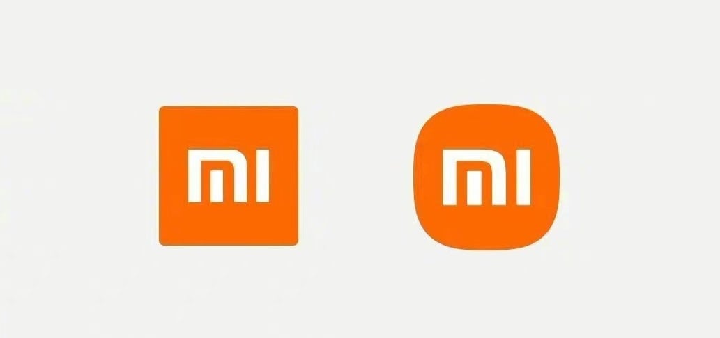
This logo, in addition to refreshing the brand image, is also a way to celebrate the ten years since their birth. Xiaomi also adds that the new logo means an update of the inner spirit.
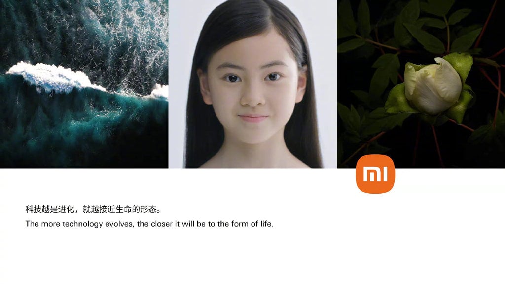
But how was this logo born? The company revealed that to integrate the brand's vision into the thinking of oriental philosophy, the internationally renowned designer Kenya Hara and Xiaomi have come together to propose a new design concept starting from the "relationship between technology and life".
Alive. A sense of life design.
This is the design concept of the new Xiaomi LOGO, and it is also the new thinking of the relationship between technology and life of Kenya Hara and Xiaomi.
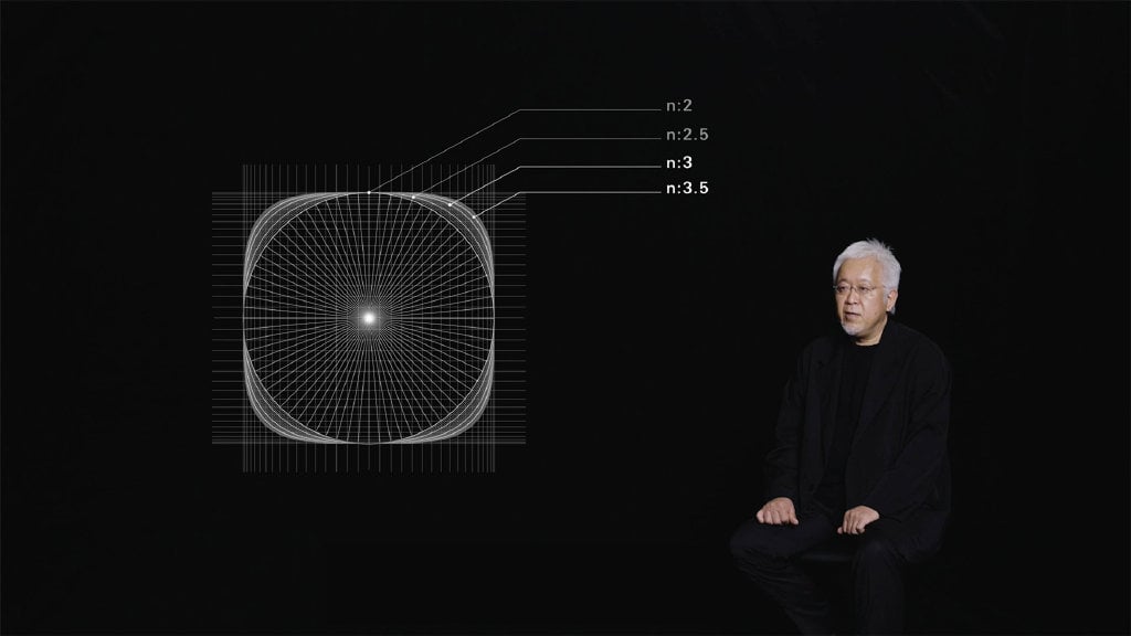
Under the “Alive” design concept, Xiaomi's new LOGO with the beauty of “super ellipse” mathematics is no longer limited to one corner of the screen, but as if it had a life of its own.
Kenya Hara has specially designed a set of Motion LOGO, so that regardless of the type of environment, it can keep the visual harmony and its personality.
The orange of Xiaomi, the silver of science and technology, the color scheme of the Xiaomi brand symbolizes the combination of vitality and high technology.
At the same time, the new “xiaomi” logo will be added to the products of the Mi series, also with the aim of representing Xiaomi's high-quality scientific and technological exploration.
Xiaomi's new LOGO will be gradually released next year. While the first product to use the new Xiaomi LOGO is the Xiaomi ecological bag designed by Kenza Hara, using DuPont ™ Tyvek® recyclable material.
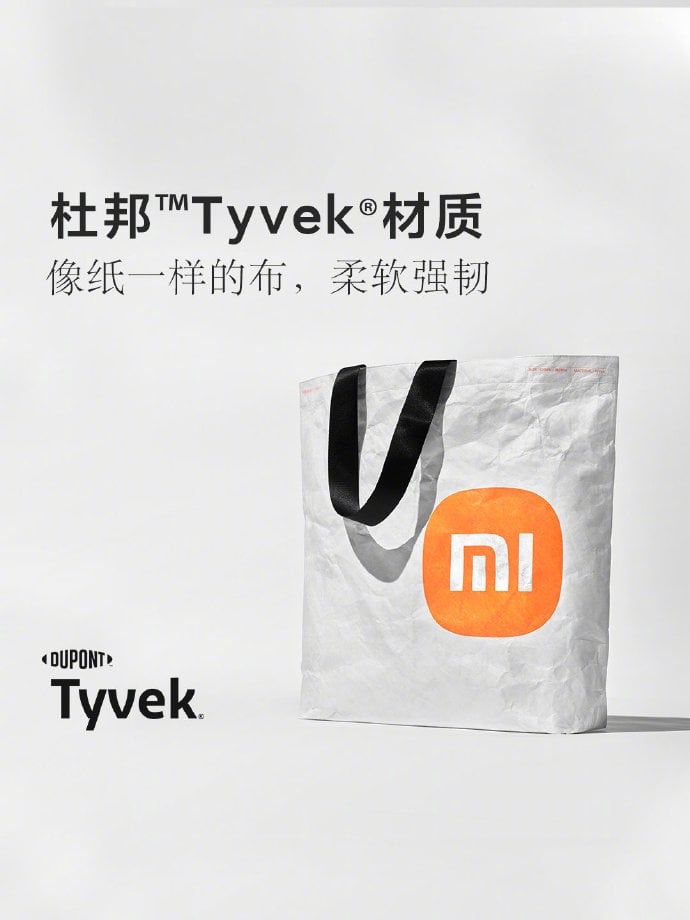
Xiaomi hopes that many will buy this new bag to try the design of the meaning of life "Alive" and assimilate the concept of using technology to improve our life.
On offer on Amazon

UPDATE OF 31/03/2021
Let's talk about the new logo for a decidedly fun update. In fact, after the presentation of the logo created by Japanese designer Kenya Hara, many, especially in China, felt "robbed" by someone who almost certainly had a millionaire salary for a job that honestly anyone reading this could have done. post armed with Microsoft Paint.
Clearly we are not the only ones to think so, so here is that after thousands of jokes on Chinese social networks addressed to Xiaomi, the brand has decided to release an official statement:
Xiaomi wants everyone to enjoy the good life brought by technology, and always insists on "making friends with users", from the masses to the high-end, from technology to art, from online to omnichannel, from China to the world, and to make those who like Xiaomi understand, as Xiaomi thinks, I decided to start from the strongest perception of all: updating the Xiaomi LOGO.
In fact, Xiaomi was already preparing for a new LOGO from 2017 and various solutions and possibilities were discussed with various design teams. Ultimately, Japanese design master Hara Kenya's solution impressed everyone, and will continue to do so for the next ten years.
Hara said the new LOGO is not just a simple change of shape, but an internal, spiritual and temperamental upgrade.
So the Chinese technology giant repeated for the most part what was said yesterday at the official presentation of the new logo.
Now we just have to see if this answer will be enough for the most hardened and probably patriotic fans of Xiaomi, or if they will ask once again how much the Japanese design master was paid.