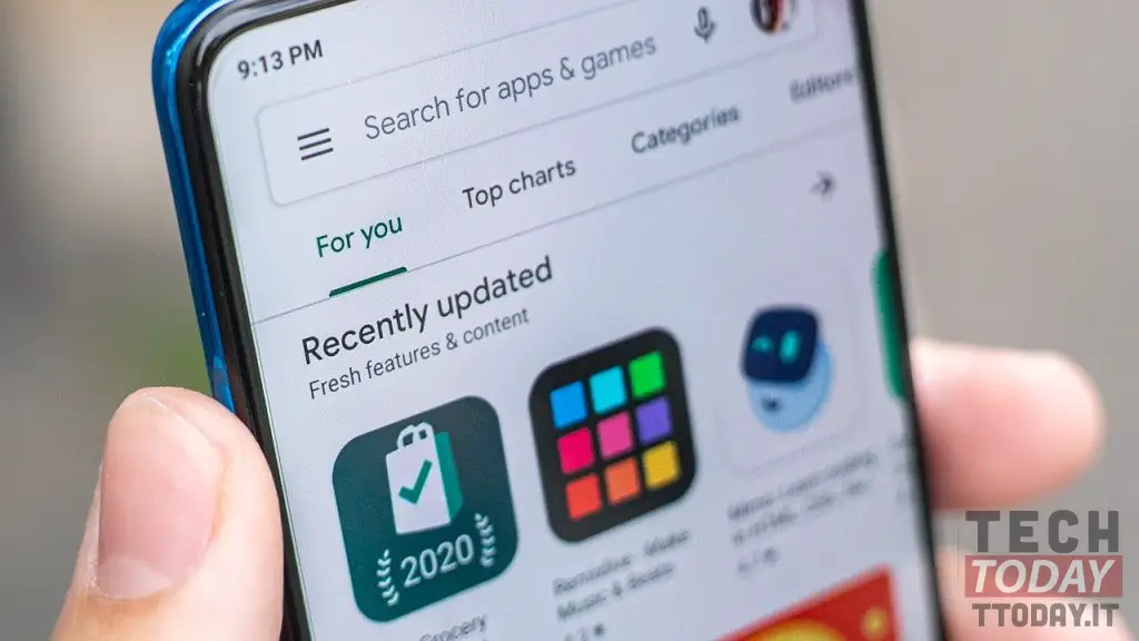
Il Google Play Store it is updated without notice and introduces new features, albeit only graphics. The well-known portal that allows all users to download applications is starting to receive a software update that slightly changes its appearance, making it more like the App Store from Apple. Let's see what the main changes are and if anything changes in terms of functionality.
Play Store receives a graphic update: now less "edgy" than before and with the "hamburger" menu moved to the right
Clearly we talk about the Play Store on Android and not via desktop. That has not been updated for some time: the graphical interface, in fact, in our opinion, should be a bit overhauled. The key innovation was the modification of the classic home page menu (the hamburger one, or the three bars as many people call it). The digital platform has borrowed one of the features of its main competitor Apple's App Store. Below you will find the images with the main differences.

The hamburger menu is no longer on the top left Settings interface Borders have been removed for a more design bold
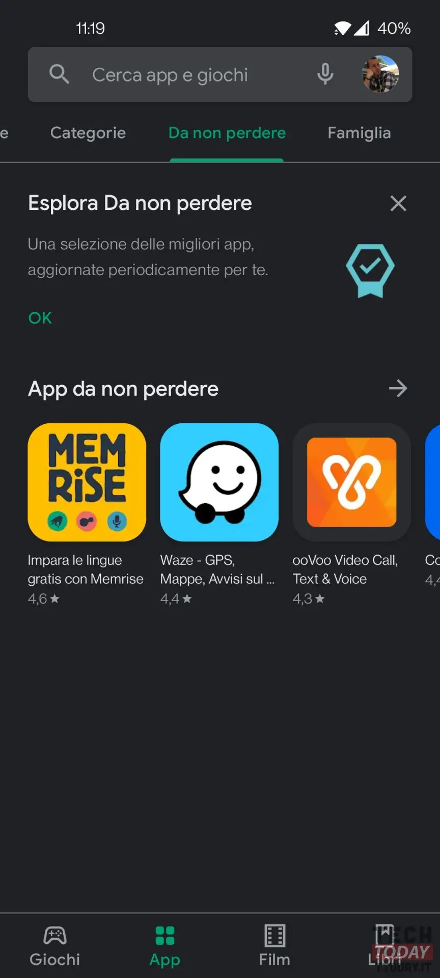
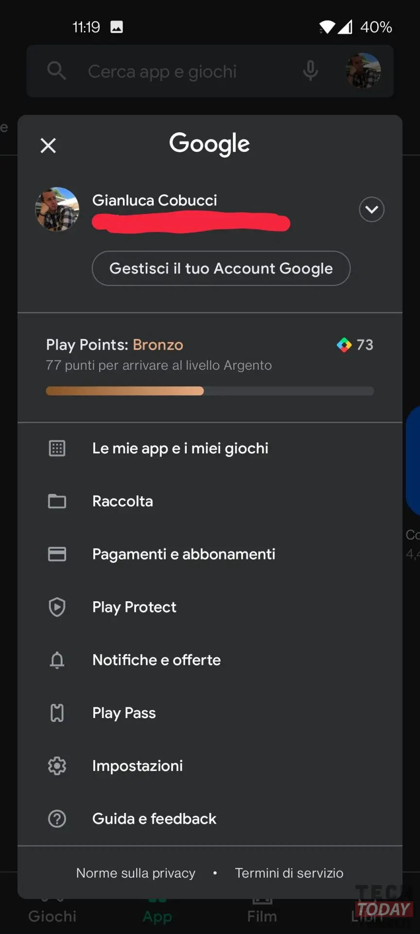
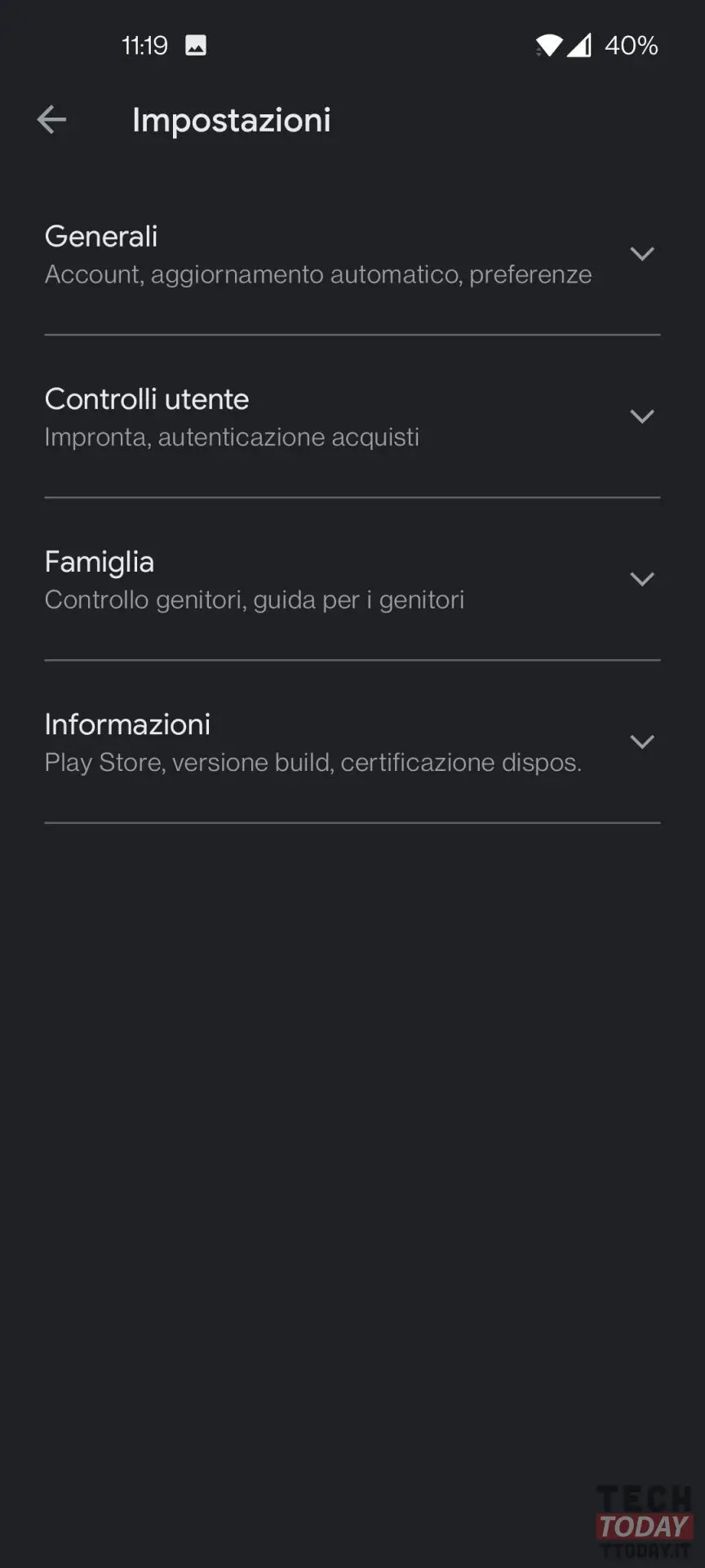
As we can see (photo on the left) the menu of settings, that is the three bars, are no longer at the top left. This can now be achieved by doing tap on the profile picture at the top right. It is here (photo in the center) that we will find all the settings, including the area Le mie app ei miei giochi where the updates for all installed apps.
The shops and the menu items themselves have been reworked: now they have gotten smaller due to the grouping into subfolders. Interestingly, similar solutions were previously implemented by Apple in the iOS application store. The new Google Play interface design is already available in select regions and is spreading in waves with Android system updates.
On offer on Amazon