Il Google Play Store di Wear OS, an operating system dedicated to the smartwatches of the various companies, has been updated. Appearance of the portal where apps are downloaded received a change of look. This change isn't just aimed at rejuvenating though. Indeed it was simplified the interface a little bit to make it leaner and more immediate. Some windows have also been removed to give more importance to other elements. Let's see the change in detail.
The Wear OS Play Store has changed its appearance: here are all the news that the application portal has and the differences with it before
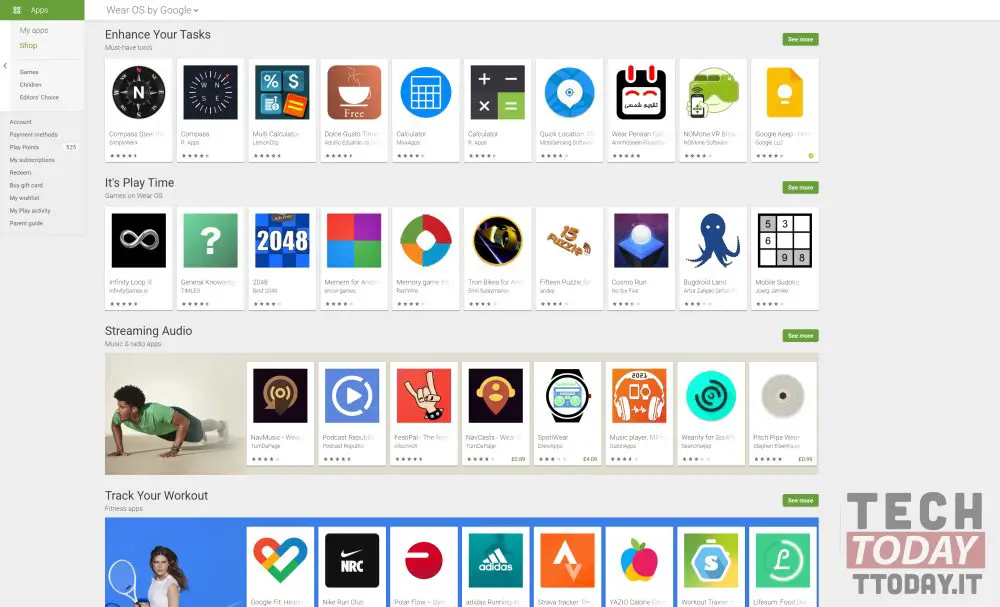
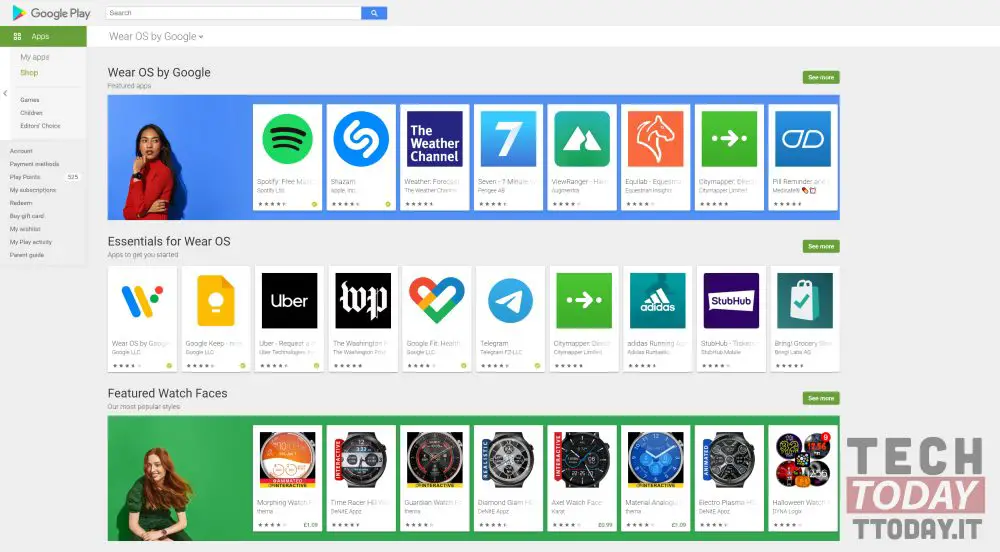
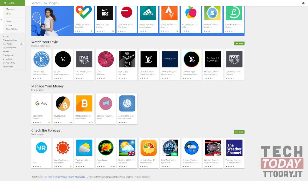
The change to the Wear OS Play Store was made in the last few hours. According to the archive, the update arrived on the server side has arrived between yesterday evening and today morning. The layout and main screen of the Play Store has changed and not poco. Unlike before, the interface is now more dynamic and less schematic. Google has added some color and gave more prominence to the sections "Featured app","App to get started"and "Dials in the foreground".
Read also: Wear OS adds UV index on smartwatches: summer don't fear you
The new main sections also include "Essential tools","Games on Wear OS","Music and radio app","Fitness app","Finance app"and "Weather app". But basically what are the radical changes? Apparently Google is moving towards another goal, namely that of make applications more prominent rather than having huge sections to choose from. Clearly these applications will arrive in the section of recommended apps based on our usage. The result is a light, uncluttered and clean layout.
Clearly changes have been made to the Play Store for Wear OS from browser. For smartphones, this remains the same.
On offer on Amazon
Through | 9to5Google